


In an overcrowded market of aged care brands, few stand out and a generic look prevailed. Domain Aged Care approached Principals with a brief to stand out from the crowd and gain a bigger share in the market.
We presented two concepts and two different names with my direction pursuing a more daring approach.
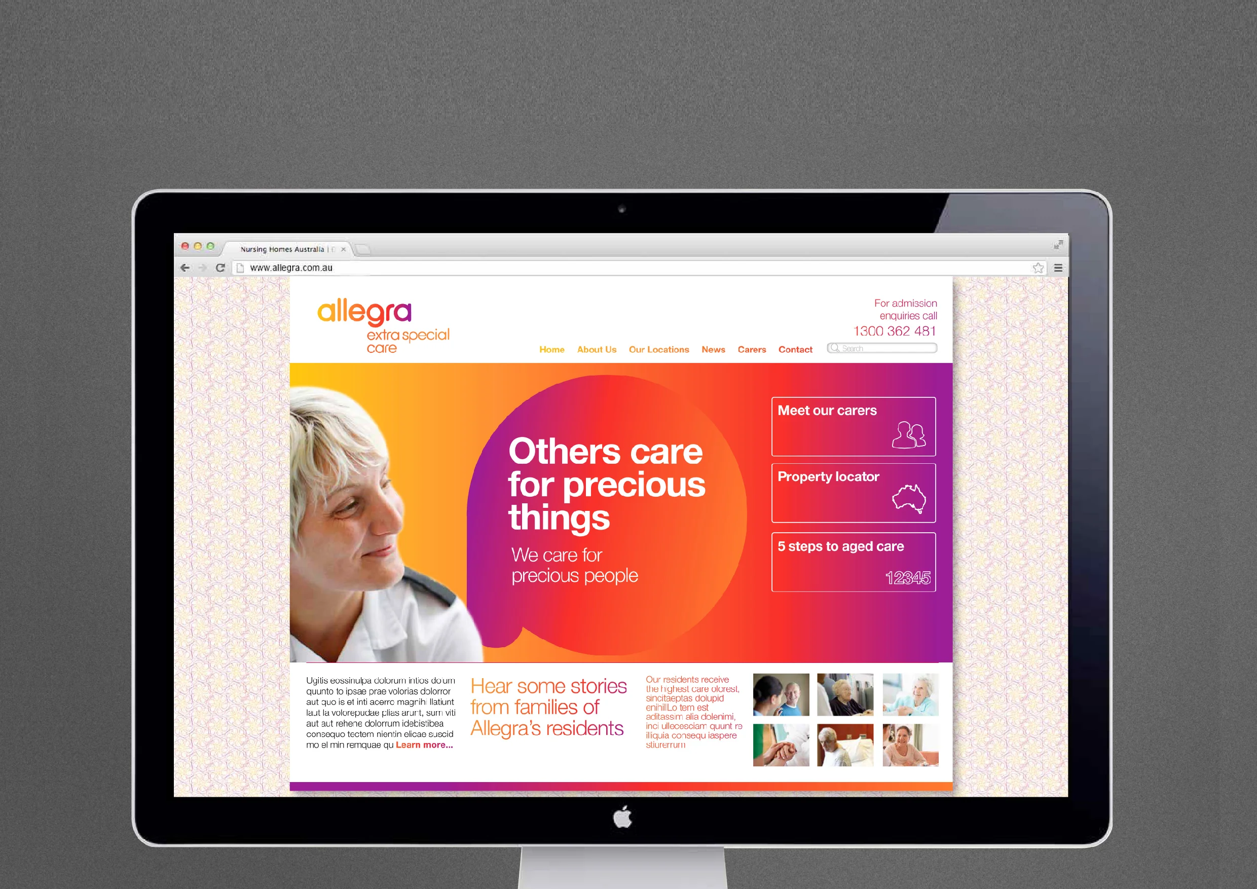
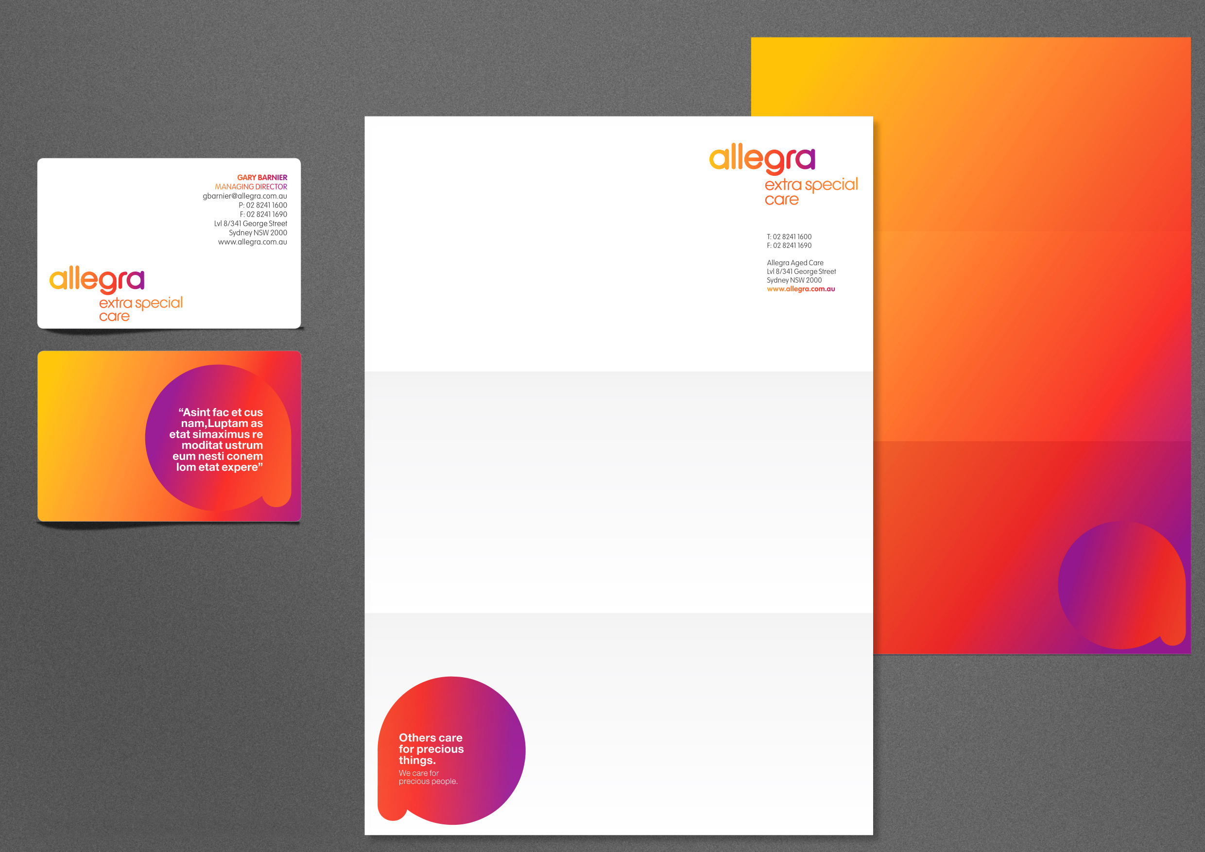
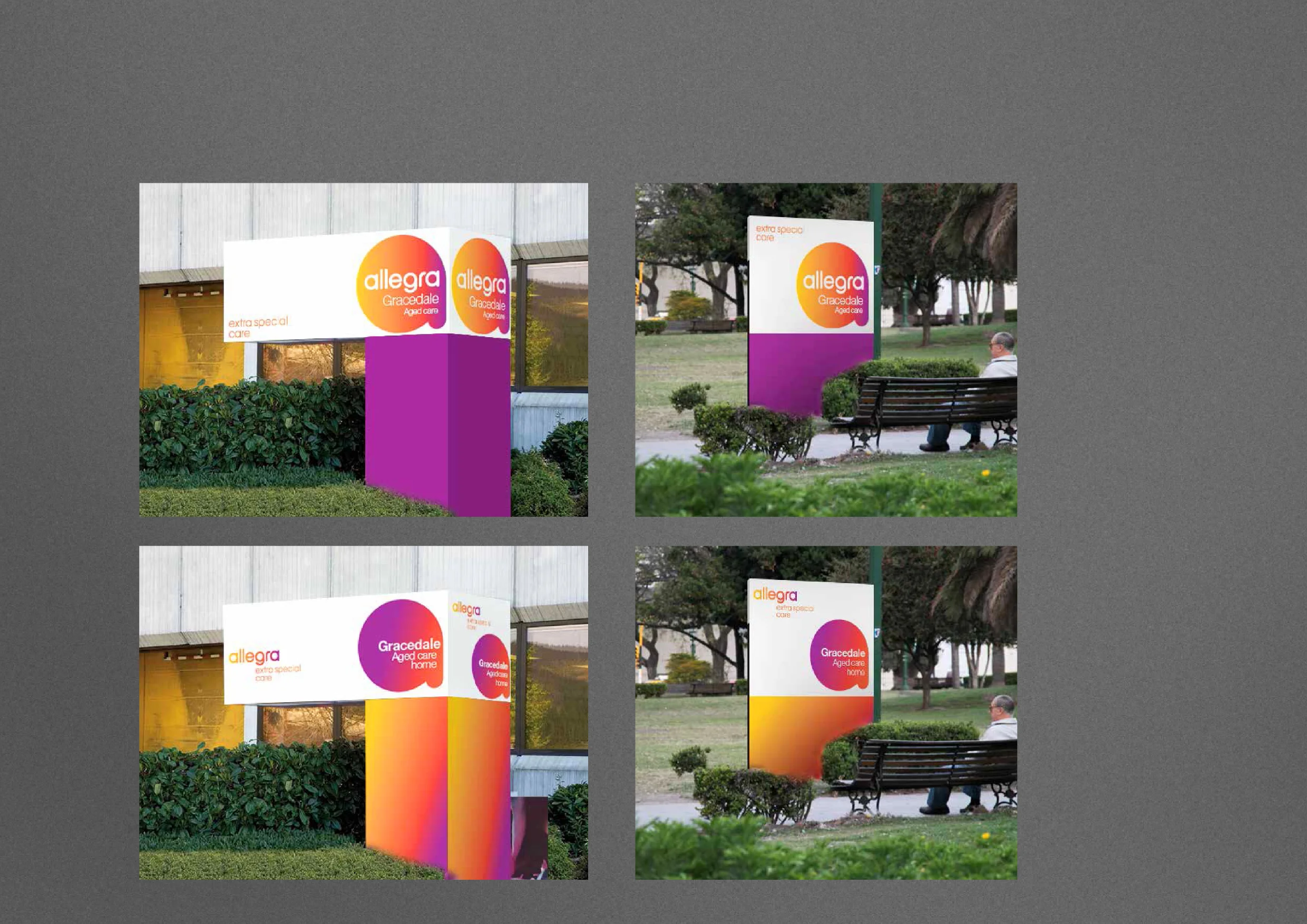
A rounded and cosy word marque coupled with a fresh colour palette aims to put the beige and dreary stereotype of aged care to bed.
This was combined with photography to capture the tender moments, the human touch and extra special care which they provide.
Design and art direction.