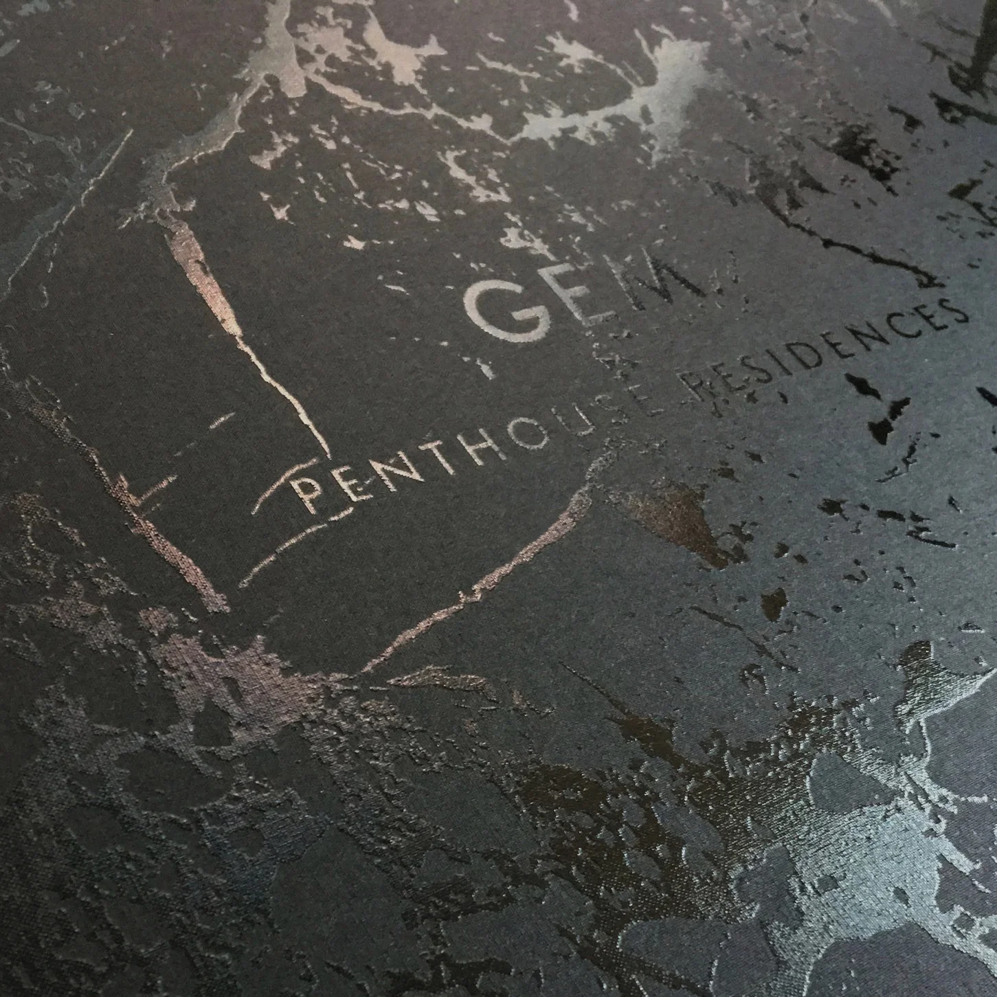
Building on the existing Gem brand, the brief to Metropolis was to create a brand just for the penthouse properties.
Celebrating what was unique in the finishes of the residences, we played on the mystery and premium qualities of black to seduce potential customers.
The brand tag of ‘Next Level Luxury’ married with black foiling and embossing to add subtle sophistication in the brand roll out.
Design, art direction and roll out.
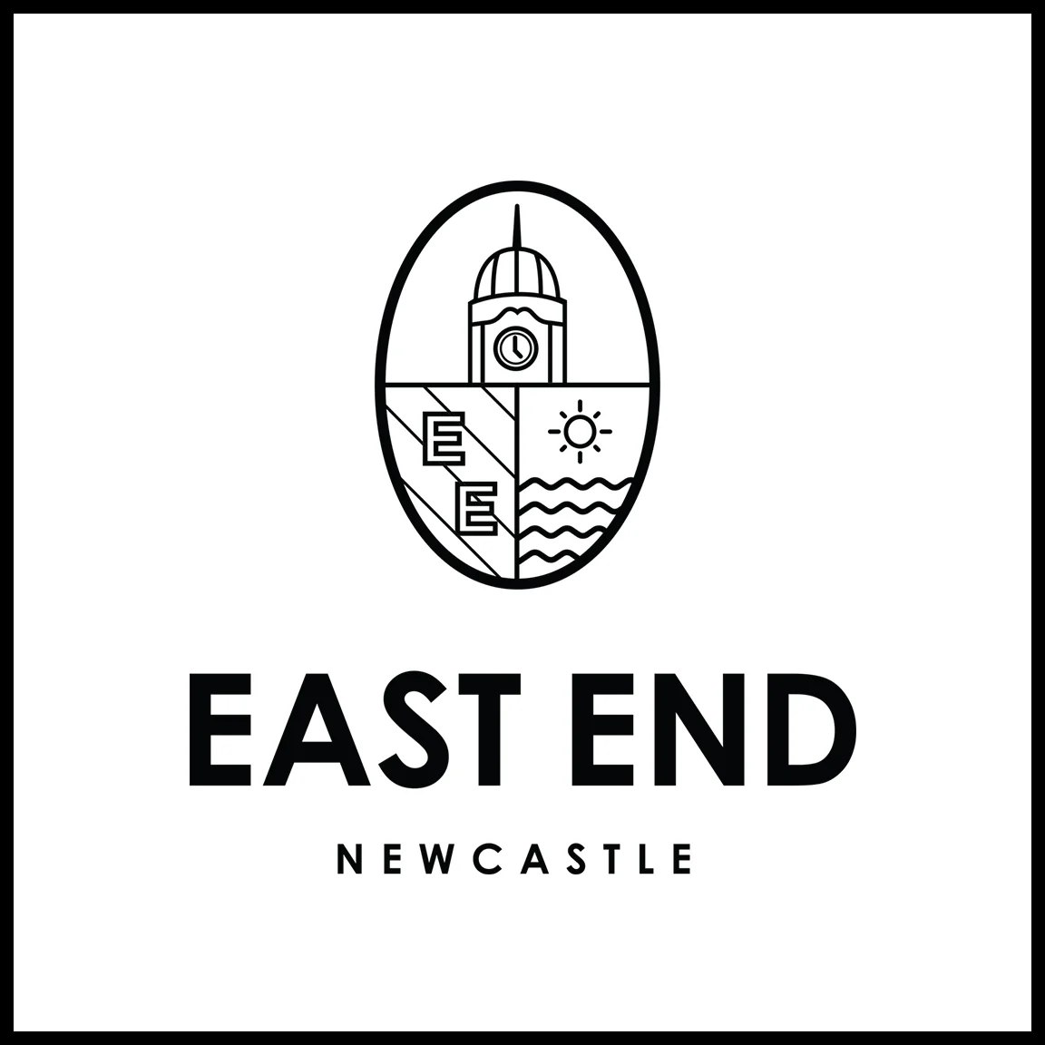
This brand direction was presented whilst at Metropolis agency as part of the $750 million East End Newcastle redevelopment project.
The creative focussed on celebrating important icons of Newcastle. A proud coastal town with a rich and diverse history, Newcastle is significant in its past and the East End is proposed as developing an icon for its future.
Whether celebrating landmarks, street corners or local heroes, the concept highlighted their value as part of the rich tapestry which makes the East End, and Newcastle, so iconic.
Design and art direction.
Brand illustrations designed for East End Newcastle.
Featured throughout the new brand developed at Metropolis, they're a representation of a bright future in the regeneration of East End Newcastle, and city as a whole.
More information on the development at eastendnewcastle.com.au
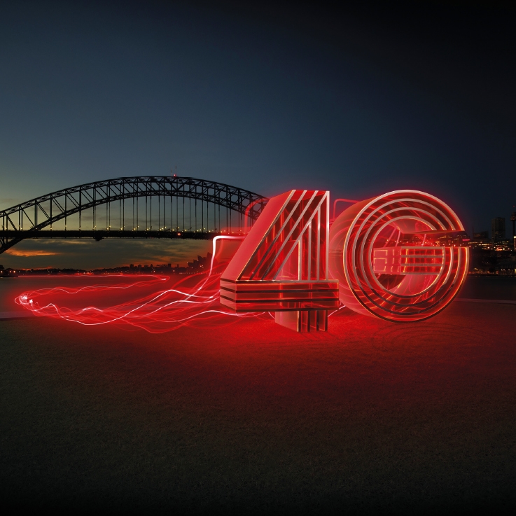
Although the last of the major networks in Australia to launch a 4G service, Vodafone’s offering was by far the fastest outstripping the competition by a considerable margin.
The brief to us was to communicate the new super fast 4G was here, but also to create something tangible for customers to understand and remember.
The solution involved designing a huge real life dynamic and lightning fast 4G, constructed by partners at Big Kahuna Imagineering, with the aim of touring the model around the country to signify the launch of the service to their area.
As the creative lead on the project we commissioned two photoshoots in Sydney Harbour and Waterloo and oversaw a large roll out of advertising across numerous digital formats, print media and outdoor space.
Design and art direction: Andy Greer
Copywriting: Ally Neill
In an overcrowded market of aged care brands, few stand out and a generic look prevailed. Domain Aged Care approached Principals with a brief to stand out from the crowd and gain a bigger share in the market.
We presented two concepts and two different names with my direction pursuing a more daring approach.
A rounded and cosy word marque coupled with a fresh colour palette aims to put the beige and dreary stereotype of aged care to bed.
This was combined with photography to capture the tender moments, the human touch and extra special care which they provide.
Design and art direction.
I was brought in to Brave agency to work on the business class rebrand, part of the overall Air Pacific relaunch. Tabua Club took it’s name from the tabua which is a highly valued cultural symbol in Fijian traditions. The polished tooth of a sperm whale, it features in many important ceremonies and is considered a rare and precious item.
The marque created utilised a graphic treatment of the tabua combined with a light and almost weightless font as a nod towards the elegance of flying with Air Pacific’s business class.
Dream-like photography of a tropical beach paradise became the hero visual for the brand, alongside a suite of new photography that worked across the brand as as whole.
Roll out of the brand included a variety of collateral including the design of wall graphics, check in counters, seat headrests, tickets, luggage tags, membership packs, press ads and the template for the inflight magazine.
Design and art direction.
As well as a new strategic direction, Vodafone wanted a new brand campaign to launch the refocussed foundation initiative.
Previously the foundation worked with a range of charities for a variety of purposes and causes. The new direction was much more pointed; the aim of supporting smart technology for a healthier Australia.
Visuals for the campaign helped illustrate the story of the foundation and the different areas they were working in. ‘Small Apps. Big Changes’ positioned the campaign and helped consumers understand some of the key projects they were working on, such as Dream Lab which used the power of the smartphone to help cure cancer while they sleep.
It was important to subtly differentiate the foundation from the consumer brand, and this was aided with a real world aesthetic of screen print ink graphics and recycled papers.
Design and art direction: Andy Greer
Copywriter: Ally Neill
Art direction and design: Andy Greer
Copywriting: Ally Neill
Illustrations: MJ Boaretto Pureza